Flat plan of front cover

I took ideas from this issue of Q magazine because initially the artist on the front of the magazine drew me to like it since i'm a fan of Ed Sheeran. I also chose to use this magazine as inspiration as I previously deconstructed it and I really like the layout and the way the text has been positioned. I plan to position my artists name in a very similar place to the position of the artists name on this magazine. I'm also going to position the coverlines on the right of the magazine in the same way (Artists name and a brief description of the content surrounding them) as i like that the text isn't covering too much of the main image.

I chose to use the same graphic as this magazine as I like the way it's been set out and I feel that it makes the text stand out a bit more.

I previously deconstructed this magazine and chose to use it as inspiration for my front cover as I like how the barcode has been positioned in a way that it doesn't cover too much of the model. I also like how there's extra text added at the bottom of the page. The main image on this magazine really draws me to it and so I've decided I'm going to use a similar angle as it shows the models face clearly as well as what she is wearing.
Flat plan of contents page

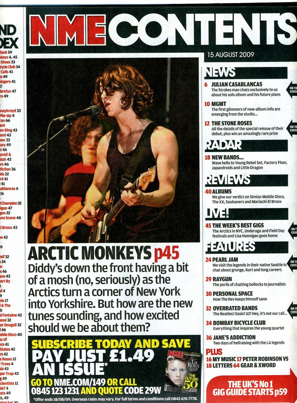
I've chosen to use similar headers to this magazine contents page as well as positioning of the text as I feel that the headers they've used are appropriate for my magazine and it gives me space to have my pictures on the left hand side rather than on the right or in the middle.

I've taken some ideas from this Q magazine contents page as I like the way that they've included a small banner/caption on the image that they've used and a page number as it makes it stand out a bit more and also putting the page number on the image with a caption shows the reader what the contents of the page includes. Although I haven't positioned my picture in the same place as the Q magazine contents page, I've used it as inspiration since I really like the camera angle used and also the background of the image as it makes a difference to have a picture that isn't just a plain white background. I won't be able to completely recreate the background but I have decided that one of the pictures included on my contents page will be similar to this image except it'll be a longer shot.
Flat plan of double page spread

For my double page spread I've used the same style as this double page spread from clash magazine. I used this as I like how the image is separate from the text and I like where the artist's quote is positioned at the top. I also like that this double page spread is quite simple and it doesn't have too many images/For my double page spread it's likely that I will have a lot more text than the clash magazine double page spread but I'll be able to use the empty space/
Although my flat plans don't include any colour I've thought about my colour scheme and I'm going to use the shade of red that my artist will have on her lips as my main feature colour as I've noticed that its a current theme in a lot of indie music magazines and it makes the text stand out really well.